您现在的位置是:网站首页> 编程资料编程资料
实现CSS圆环的5种方法(小结)css制作收缩圆环旋转效果实例代码css3 clip实现圆环进度条的示例代码图解CSS3制作圆环形进度条的实例教程CSS实现圆环旋转加载动画
 2021-09-04
939人已围观
2021-09-04
939人已围观
简介 这篇文章主要介绍了实现CSS圆环的5种方法(小结),小编觉得挺不错的,现在分享给大家,也给大家做个参考。一起跟随小编过来看看吧
想到去年面试实习的时候被问到实习圆环的问题,特意写篇文章总结一下吧!总结了一下大概有5种方法。
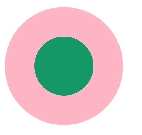
1. 两个标签的嵌套:
.element1{ width: 200px; height: 200px; background-color: lightpink; border-radius: 50%; } .child1{ width: 100px; height: 100px; border-radius: 50%; background-color: #009966; position: relative; top: 50px; left: 50px; }2. 使用伪元素,before/after
.element2{ width: 200px; height: 200px; background-color: lightpink; border-radius: 50%; } .element2:after{ content: ""; display: block; width: 100px; height: 100px; border-radius: 50%; background-color: #009966; position: relative; top: 50px; left: 50px; }3. 使用border:
.element3{ width: 100px; height: 100px; background-color: #009966; border-radius: 50%; border: 50px solid lightpink ; }4. 使用border-shadow
.element4{ width: 100px; height: 100px; background-color: #009966; border-radius: 50%; box-shadow: 0 0 0 50px lightpink ; margin: auto; }.element5{ width: 200px; height: 200px; background-color: #009966; border-radius: 50%; box-shadow: 0 0 0 50px lightpink inset; margin: auto; }5. 使用radial-gradient
.element6{ width: 200px; height: 200px; border-radius: 50%; background: -webkit-radial-gradient( circle closest-side,#009966 50%,lightpink 50%); }如果大家有其他的方法,请告诉我吧,谢谢!!!
以上就是本文的全部内容,希望对大家的学习有所帮助,也希望大家多多支持。
相关内容
- 纯css实现漂亮又健壮的tooltip的方法 div+css样式自制带小三角的tooltips效果CSS3 函数技巧 用css 实现js实现的事情(clac Counters Tooltip)纯CSS3实现自定义Tooltip边框涂鸦风格的教程用简单的jquery+CSS创建自定义的a标签title提示tooltip关于CSS Tooltips(鼠标经过时显示)的效果怎么用纯CSS制作带小三角的tooltip提示框
- css实现左侧固定右侧自适应的布局方式css实现元素居中的N种方法div水平布局两边对齐的三种实现方法waterfall瀑布流布局+动态渲染的实现页面中有间隔的方格布局如何完美实现方法css实现六种自适应两栏布局方式使用flex布局轻松实现页面布局的示例代码使用Flex布局实现头部固定内容区域滚动的方法详解flex布局下图片变形的解决方法详解flex布局与position:absolute/fixed的冲突问题Flex布局实现div内部子元素垂直居中的示例
- CSS中clip-path属性的使用详解CSS中的clip-path区域裁剪属性使用教程
- CSS中filter属性的使用详解详解CSS3中强大的filter(滤镜)属性使用CSS3滤镜的filter:blur属性制作毛玻璃模糊效果的方法css3背景图片透明叠加属性cross-fade简介及用法实例
- 基于 CSS 动画的 SVG 按钮实例代码CSS3 水墨风格背景动画按钮CSS+JS实现水滴涟漪动画按钮效果的示例代码
- CSS :visited伪类选择器隐秘往事回忆录dw中css选择器nthchild怎么使用?css选择器中有小数点的标签获取方法CSS3 :default伪类选择器使用简介CSS选择器的新用法(推荐)CSS选择器实现字段解析CSS中选择器的权重值的计算Dreamweaver中css选择器中的类怎么使用?详解CSS3选择器:nth-child和:nth-of-type之间的差异总结30个CSS3选择器 css3类选择器之结合元素选择器和多类选择器用法
- CSS实现footer“吸底”效果详解CSS五种方式实现Footer置底利用CSS使footer固定在页面底部的实例代码html的footer置于页面最底部的简单实现方法详解HTML5将footer置于页面最底部的方法(CSS+JS)
- 使用CSS content的attr实现鼠标悬浮提示(tooltip)效果CSS实现鼠标悬浮无限向下级展示的实例代码CSS鼠标悬浮DIV后显示DIV外的按钮解决方法CSS3制作了一个动画导航效果(鼠标悬浮会放大)css实现缕空遮罩层的示例代码css3遮罩层镂空效果的多种实现方法CSS实现带遮罩层可关闭的弹窗效果CSS实现鼠标移至图片上显示遮罩层效果CSS 鼠标悬浮在图片上添加遮罩层效果的实现
- 纯css3实现宠物小鸡实例代码css3中transform属性实现的4种功能详解CSS3.0(Cascading Style Sheet) 层叠级联样式表纯CSS3实现div按照顺序出入效果CSS3实现列表无限滚动/轮播效果css3 利用transform-origin 实现圆点分布在大圆上布局及旋转特效CSS3实现的侧滑菜单CSS3实现的3D隧道效果用CSS3画一个爱心css3 实现文字闪烁效果的三种方式示例代码六种css3实现的边框过渡效果
- css实现三栏布局的几种方法及优缺点CSS经典三栏布局方案(6种方法)浅谈CSS三栏布局的N种实现CSS实现三栏布局的四种方法示例CSS三栏布局探讨——中间固定宽度两边自适应宽度CSS Float布局过程与老生常谈的三栏布局 DIV+CSS 三栏布局实例代码
点击排行
本栏推荐